Interactive Data Map
The Targeted Response product team at Compassion International was working to launch an MLP web app for their sales and marketing users. One of the top requested features was an interactive map that showed countries impacted by certain categories.
The data the Targeted Response team owned was text heavy, and difficult to consume at a glance, and the target users were often wading through external databases in order to find or create maps visualizing the data. So we set out to simplify their workflows, and add an interactive map to our tool.
Background
The Targeted Response product team is responsible for collecting and distributing the need and response plans for 20+ countries at Compassion International. They work closely with marketing and sales relationship managers to provide the data needed to create informed campaign plans and donor proposals based off areas of greatest need.
The plan information before the web app was launched was text-heavy and very difficult to sift through, and the target users often had to dig for additional data from several different tools in order to create their campaigns and proposals. One of the tools they referenced most and loved using had interactive maps, which was not a feature the Targeted Response team had yet been able to provide.
So we set out to create an interactive map for our users. So they could learn at a glance what they otherwise would have had to dig for hours in various tools to discover.
Research and Discovery
Our creative team ran a design sprint for the product launch, and I ran a several additional potential user interviews where participants walked me through their current processes and tools.
We discovered that users took one of 2 approaches to the data:
“What are a region or countries top need?” (Our sales personas typical approach)
- or -
“Which country has the greatest need in X category?” (Our marketer personas typical approach)
This insight helped us to uncover that while the map itself was a top requested feature, it would be exponentially more impactful when paired with a quick summary of top needs.
We knew we needed to create the map component based on these two user stories, one tailored for our target Sales User and one for our target Marketing User.
Design Process
I started out by collecting links to the maps our users were referencing so I could learn how their interactive properties worked and keep their current experience in mind.
I detailed an interaction map in Miro, summarizing the high-level interactions that could be made through the map, filters and search field. All of these interactions would impact the map in different ways so the product owner and I reviewed these first before I moved forward with design work.
Our map would be accompanied by country and category filters, and need to respond dynamically. So I then began to digging into some industry standards.
How did they change based on filtering?
What interactions with the map itself should I consider?
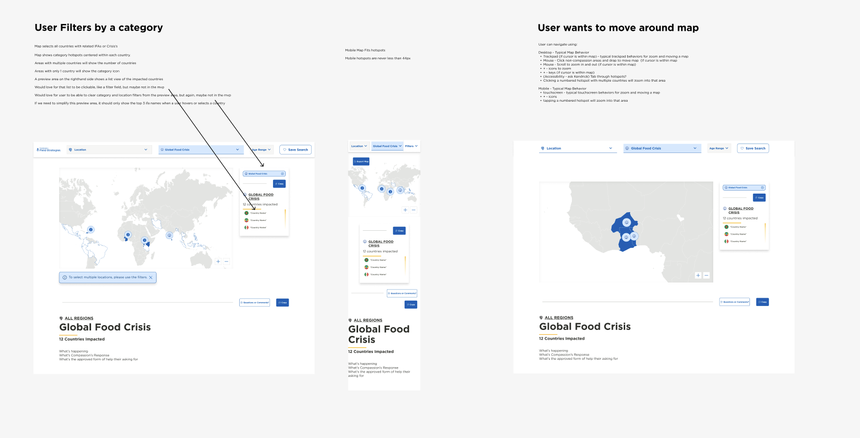
At the default view, or if a user filtered by a location the summary area would highlight the top 3 funding needs.
I started into lo-fi designs for the location-based user stories first. We used screenshots of a grayscale map and a little blue overlay to show highlighted areas. It was just what we needed to jumpstart us, as we asked the questions:
“What happens when a user filters by a location vs interacting directly with the map?
“What sort of information do we need to accompany the map?”
Next, we needed to design what categories would look like on the map.
At this point, with our short timeline, I needed to shift into hi-fi designs.
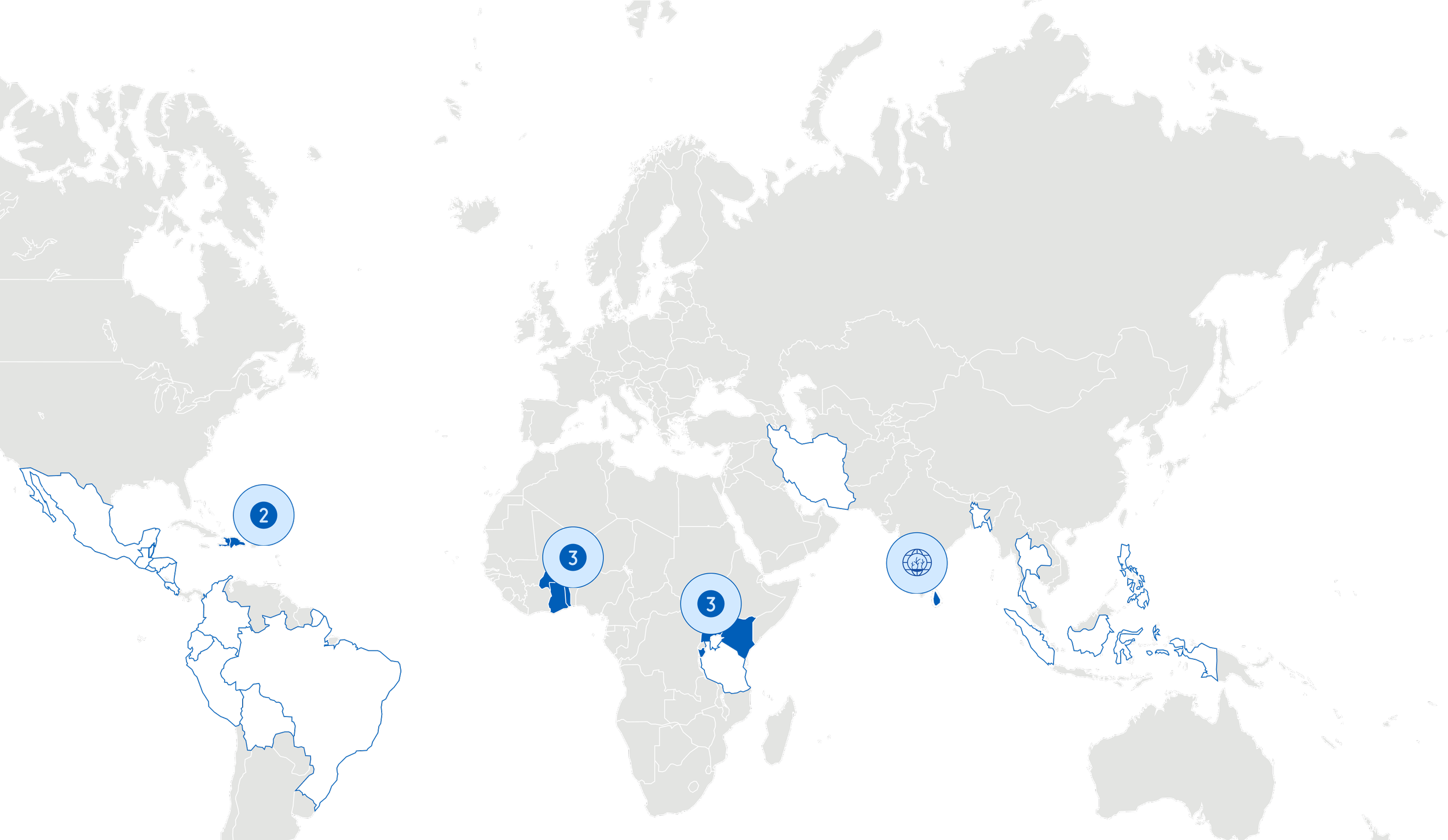
I quickly discovered a related issue. The simple “colored highlight” of a country was not sufficient for categories, since countries vary in size and that didn’t accurately depict the weight of a need in a given category. Additionally, users would have to zoom in and out on mobile since the touchfield for those smaller countries would be really small.
So I leaned into the pin design, commonly used in Apple maps to show the quantity of locations in an area when their is a cluster. It created a perfect solution for the touch field, zooming the user in when they tap a pin with multiple locations, and also gave me the design for when a user filtered by a category.
Based on our research insights, we knew that the top questions our users wanted to answer were:
“What are a countries top needs?” - or - “Which countries have the greatest need in X category?”
So I knew I needed to show some summary data right away. I didn’t want this data below the map, where the user needed to scroll, so I designed a summary area, where ideally, a user wanting to answer a quick question could do it all without scrolling. We added a copy/paste button to the summary area, because our users were always typing the data they found into their proposals.
If a user filtered by a category, the map would highlight the impacted countries, while the summary area would list them, filtered by financial need from greatest to least, easy to copy out into a proposal.
The final piece of this design was what happened to the map when a user filtered by a category but selected a country outside the filter.
On both desktop and mobile, we didn’t want to slow the user down at all from getting to the information they needed, so the category filter was simply removed once a user selected a country not impacted by that category. But on desktop, we did add a hover feature to the summary area, that alerted the user they were going outside of their search criteria before they clicked.
If a user selected a category AND a country, the country would be highlighted on the map, but the pins would also show other impacted countries. The summary area would then show the names of the plans that selected country had which correlated to the fund category the user had filtered by.
Final Result
The web app is an internal tool for Compassion Staff only, so while I cannot provide a direct link for you to experience the site, you can check out the basic prototype, or reach out to me for more info!
For the launch, we started with the most basic version of the map; highlighting countries impacted by a location or a category filter. It allowed the user to interact by zooming in and out, and selecting an individual country.
With our second feature set, we added the pins, giving more visual weight to smaller countries, and improving the mobile experience.
Finally, the summary area is a top feature set to release next, with the rest of the groundwork laid for the data it should only take a couple of days for the development team.