Launching an internal web app tool for Sales & Marketers at Compassion
Making hidden, complex data visible and simple for marketing teams in 12 countries.
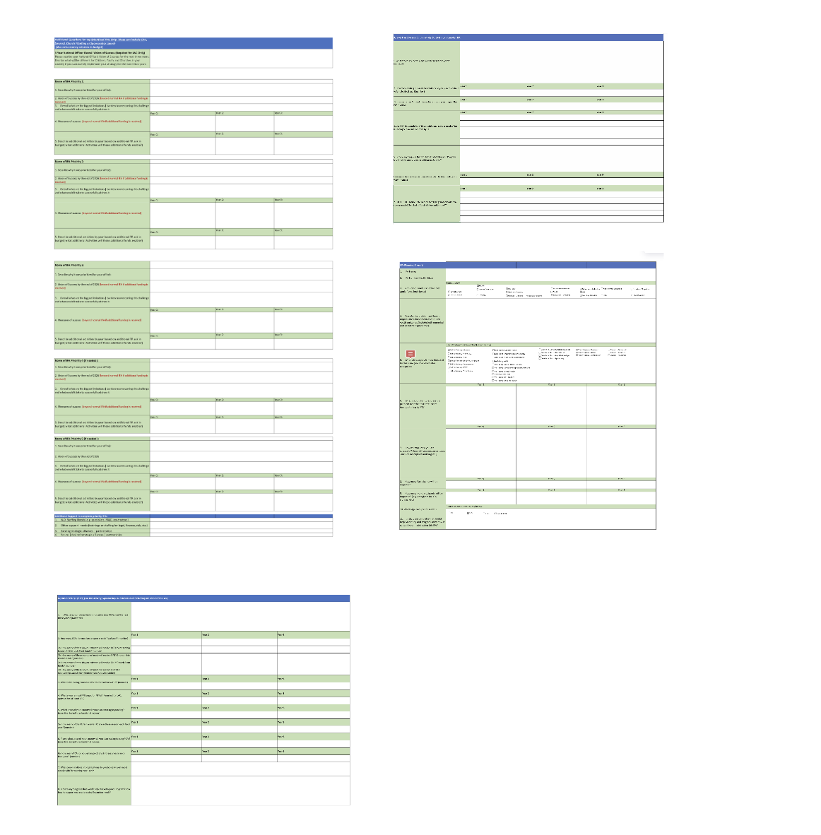
Excel anyone?
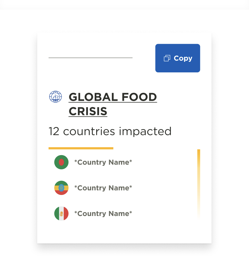
It started with spreadsheets. Giant spreadsheets from 20+ countries with information vital to the many marketing teams around the globe at Compassion International.
Anyone looking for the information in the spreadsheets also needed contextual data, such as “How many children are supported in this country?”.
This data lived in several different tools, some only accessible to marketers based in the US, or was known only to subject matter experts.
The Goal
Our team decided to make a tool that brought everything together into one place.
Something that showed the most-needed data first, giving highlights while allowing a user to dig deeper. A tool that could collect and display similar data from different countries and regions.
We wanted to create a tool that would empower our employee base to not only accomplish their day to day tasks, but provide them with the confidence to speak out about complex poverty issues in any given country.
We wanted anyone to be a subject matter expert.
01. Explore and Organize
Our creative team ran an ideation session with stakeholders and potential users, to get a rough idea of the needs, and start brainstorming features. I began a deep dive into the spreadsheets, starting to sketch out a sitemap, and documenting the key paths a user would take to access the data.


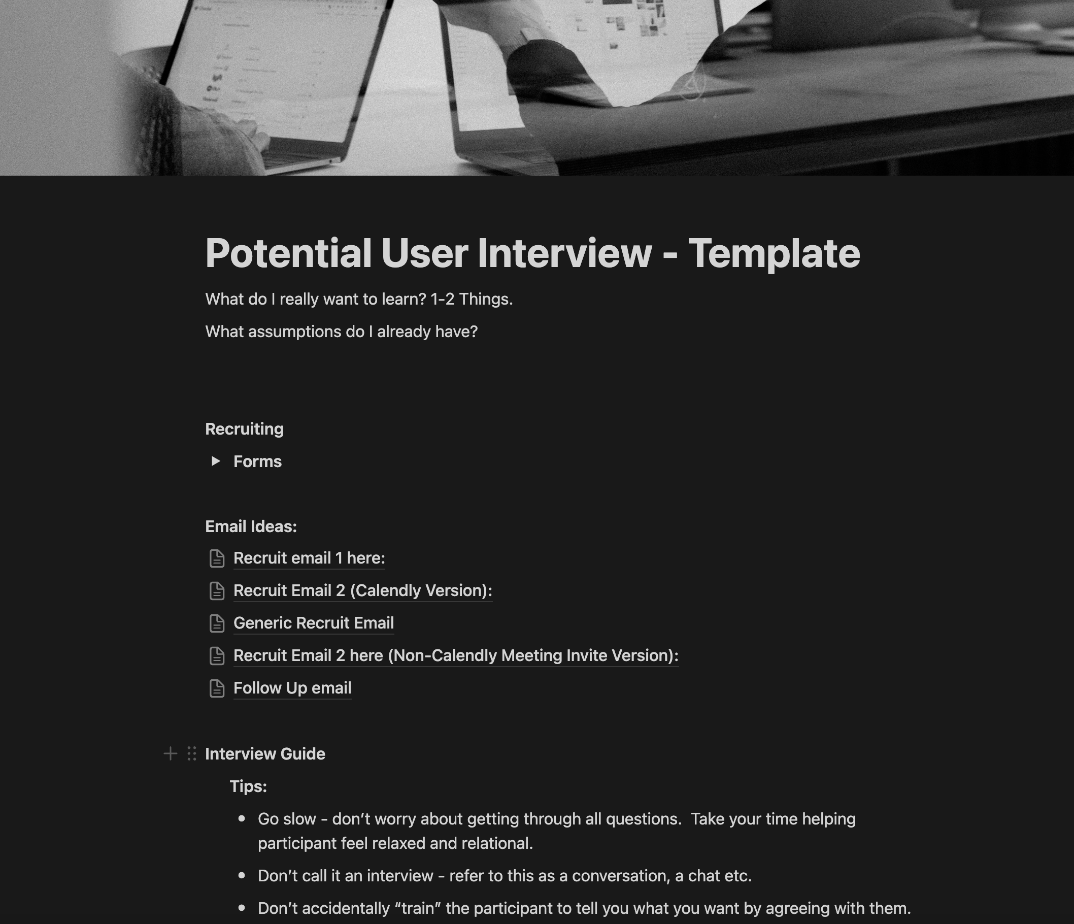
02. Dig Deeper.
Before I could start on any UI, I needed a better understanding of my users, their needs and their current toolstack. I ran potential user interviews and setup group chats with target users who were willing to educate me on their needs and provide async feedback on design work and direction.
03. Data to Design
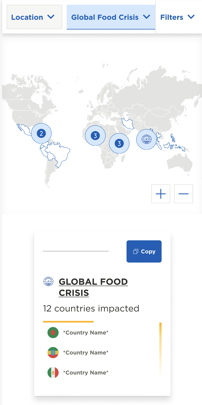
Once I felt in tune with the problems that our target users were facing, I began design work. I mapped designs back to the high-use areas of the spreadsheet, proposing where top data could aggregate for key insights, and suggesting certain data remain hidden until the user asked for it.
I added moments where key data found in other tools would be pulled in so that our users had a one-stop shop for all their information.

04. Flex and Simplify
We had a short launch timeline for the MLP, so I began collaborating with our developers from the start. Problem-solving and simplifying as the designs evolved. With our solid base of potential users providing feedback, we were able to make informed decisions on what could be cut, what was a must-have and what we could simplify while still creating a product our users would love.

The Results
We launched our MLP and it was met with immediate positive feedback and usage began to spread like wildfire. We not only met the needs of our target user, but many other teams we had not planned for began adopting the tool as a part of their day-to-day activities.
We ran usability testing, worked through high-priority fixes and began releasing new features based on feedback.
We released a large feature set in January of 2024.
Mobile
Desktop

The Feedback
-
![]()
“I can’t thank you and team enough for your diligent and neighbour-centric work on this! I am delighted by what you’ve delivered at this stage, and the progress it represents for our organization. I can only imagine the time and effort that went into it, and how heavy of a lift it would be to get it off the ground. Well done, and truly: Thank-you!"
Allison Alley, President & CEO - Compassion Canada
-
![]()
"OK, now I'm jealous...... …..that all the new people will have such a great tool to use for decades with our supporter families…"
Steve Wilson, National Director of Business Relations
-
![]()
"She was a true visionary in mapping of complex information into simple and accessible designs."
Amy Haddock , Product Owner
-
![]()
"You created a platform that is really user-friendly and makes navigating opportunities easier than ever before. You worked cross-functionally to build strong relationships and listen to the needs of users, which resulted in an exceptional product. Thank you!"
Hailey Parkman Senior Manager of Marketing Development
-
![]()
"I was very impressed with Laura’s ability to take a wide range of both narrative and quantitative data and extract it into a clean and clear format that made complex information easy to understand and use and beautiful to read. Laura was also great to work with, able to explain the technical requirements of the project in relatable terms. It was a truly wonderful collaboration."
Christopher Devaille, Strategy and Planning


Detailed Case Studies for this Product
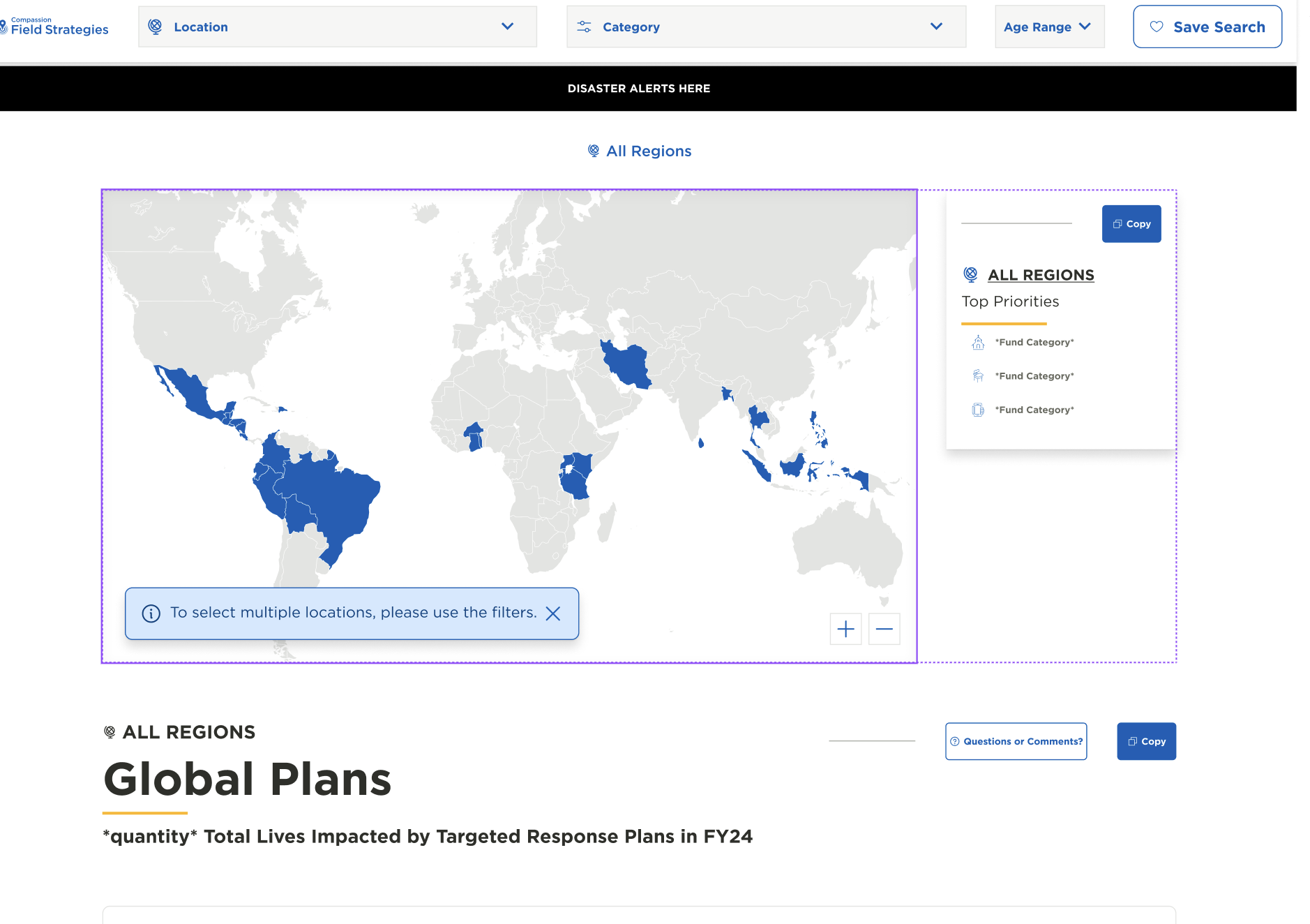
Interactive Maps

Filtering
(Coming Soon)
Disaster
Feature Set
(Coming Soon)